Dreams of Black and White: Franz Kline (1910-1962)

Recently, the Whitney Museum of American Art took a risk by relocating to a brand new building in the Meatpacking district in New York, breaking away from ‘museum mile’ to head downtown. Realizing the importance of this exciting time of transition, I decided to join the museum as a Founding Contemporary member so I could be a part of this historical moment for the Whitney. Before the museum opened to the public, I attended the opening reception preview of the current exhibition, America is Hard to See. This excellent show highlights the museum’s permanent collection, and affords visitors the opportunity to view works that have been in storage for many years due to the lack of space in the old building.

My most exciting take away from my inaugural visit to the new Whitney was a blunt realization of one of my “new” top 5 favorite artists. I put “new” in quotes because over the past three years I have been consistently drawn to this particular artist’s work without really putting a formal consciousness to this fact, and thus a deeper look into the broader history of who he was. At the reception, I was yet again blown away by one of his works and finally identified my own trend through a wildly beating heart—Stendhal syndrome is real, friends. Tomorrow marks what would have been the 95th birthday of this amazing artist. His name – Franz Kline.

Born in 1910, Kline moved to New York in1938 just before the height of the Abstract Expressionist movement—a movement he would be an important contributor to. Struggling for many years as a figurative and city scape painter, in 1950 Kline finally received his ‘big break’ that would solidify his presence on the New York art scene: a solo show at Charles Egan Gallery introduced the art world to Kline’s large black and white gestural paintings. The show was a huge success and would become his most recognized/sought after imagery.

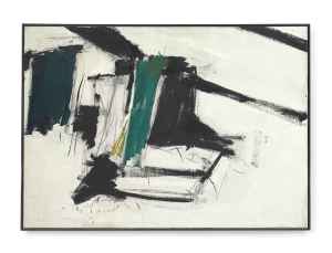
The work located at the Whitney Museum is titled Mahoning, 1956. It is a breathtaking example of his black and white abstractions that hover between Oriental calligraphy and grid-like imagery. The stark contrast between the energetic black brushstrokes and the white background adds to the emotive strength of the work. This emotion is embedded in the act of painting itself; instead of any particular “meaning” the works are instead supposed to make you feel. As Kline is famously quoted, “The final test of a painting, theirs, mine, any other, is: does the painter’s emotion come across?”

Unfortunately, Kline is another great painter who was taken from us too soon. He died of heart failure in 1962, days before his 52nd birthday on May 23. Today we honor everything he was able to give us in the precious years he did have; an oeuvre which evokes great emotion that I am eternally grateful to be able to experience.

Here are Kline’s top selling works at auction, as well as the Whitney’s Mahoning in permanent holding.

Kline_Christie's New York_Wednesday, November 14, 2012_40.4million

Untitled, 1958, sold for $40,402,500 Premium at Christie’s, November 14, 2012

Kline2_Christie's New York_Wednesday, November 12, 2014_26.4million

King Oliver, 1958 sold for $26,485,000 Premium at Christie’s, November 12, 2014

Kline3_ Steeplechase_Christie's New York_ Wednesday, May 13, 2015_21.4m

Steeplechase, 1960 sold for $21,445,000 Premium at Christie’s, May 13, 2015

Kline4_de medici_Christie's New York_Wednesday, November 14, 2012_11m

De Medici, 1956 sold for $11,058,500 Premium at Christie’s, November 14, 2012

Kline5_shenandoah_Sotheby's New York_Tuesday, November 13, 2012_9.3m

Shenandoah, 1956 sold for $9,322,500 Premium at Christie’s, November 13, 2012

kline6_flanders_Sotheby's New York_Tuesday, May 12, 2015_9.2m

Flanders, 1961 sold for $9,210,000 Premium at Christie’s, May 12, 2015

kline_mahoning

Mahoning, 1956, Whitney Museum of American Art Permanent Collection

heART,

Candy

On the birthday of Edouard Manet, a story of his death.

Manet

Edouard Manet, Le Printemps, 1881, oil on canvas, 29×20″

Le Printemps, 1881 currently holds the record for the highest price achieved for an Edouard Manet painting. A rather recent record, sold November 5, 2014, the piece soared to a whopping $65,125,000 at Christie’s in New York. A look at the history of Le Printemps reveals why this painting almost double Manet’s previous record ($33,279,822 Premium in 2010).

Born on this day in 1832, Edouard Manet is widely recognized as a pivotal figure in the development of Modern painting and the avant-garde, and consequently, for the decline of the Salon— a state sponsored institution that tightly controlled the conservative aesthetics of art production. After having his famous Le Dejeuner sur l’herbe rejected from the Salon in 1863 (which resulted in the famous Salon des Refuses the following year), and two years later Olympia accepted but ill received, Manet was the antithesis of revered Salon painting. With his hopes all but crushed, in May of 1882 Manet made his final submission to the Salon: Un Bar aux FoliesBergère and Le Printemps. At last, the subjects of this painter of Modern life were finally captivated by his revolutionary approach to painting, and the critics responded with delight. A few months later, Manet died a premature death in April 1883.

Le Printemps translates to spring, and the woman in the painting (Jeanne Demarsy) represents an allegory of this season. As critic Maurice de Seigneur wrote in L’Artiste, 1 June 1882. “She is not a woman, she is a bouquet, truly a visual perfume.” Manet’s broader intention with this work was to paint all four seasons—using the modern woman in all her femininity and style—as the vehicle. Due to his untimely death, Le Printemps remains the only finished work, with L’Automne nearly finished. As Manet biographer Edmond Bazire, lamented, “Time failed him… ‘Winter’ and ‘Summer’ were never painted, and it is a loss and a regret the more.”

heART,

Candy

The other 3 now infamous Manet paintings:

luncheon

Le Dejeuner sur l’herbe

COURTAULD 5

Un Bar aux Folies-Bergere

olympia

Olympia

Photographs of artists

Something that I think about sometimes is that fact that an artist’s work in many cases is more famous than the artist himself. Put up a slideshow of artworks by Modern and Contemporary artists and any art history nerd would be able to identify the artist’s hand in most cases. What is interesting, is until I started researching it, I would have no idea what the actual artist looked like. Even in some instances, the work of art has transcended the artist completely (in the public realm at least, not in ‘art’ circles necessarily) – as in the case of the “LOVE” sculpture by Robert Indiana in Philadelphia, or “Cloud Gate” (aka the Bean) in Chicago by Anish Kapoor.

I remember growing up, “Picasso” was synonymous with “one of the greatest artists ever to live”. I remember the first time that I saw a photograph of Picasso. He was such an enigma to me and more of a spirit/legend as the “greatest artist” that it was very disorienting to me to see a photograph of his face – proving that he was indeed a real person. I was pretty young when this moment happened, but the pattern still sticks with me in a way. For that reason, I love putting faces to the artwork. Sometimes the appearance of an artist “fits” with the way I imagined them, and in other more exciting times I am completely shocked. It’s like seeing a photograph of your favorite radio host for the first time, a voice of which you are so familiar paired with a face that you wouldn’t recognize in a crowd.

I also love the aura around what a photographic portrait of an artist “should” look like. I’ve noticed a few different categories – a) serious and pensive, b) smoking a cigarette, c) silly and fun, or d) enigmatic side profiles. Below are some of my favorite portraits of some of my favorite artists. The first two categories are set up in quiz format, see if you can guess who’s who… Some are much easier than others.

SERIOUS/PENSIVE:

a. rodin barat

b. Auguste Renoir

c. Mondrian serious

d. manet serious

e. keith haring serious

f. John-Baldessari serious

g. Joan Miro

h. Henri Toulouse Lautrec

I. Henri matisse serious

j. Edgar Degas serious

k. de kooning profile

l. Riwkin NEG 002

m. chagall serious

n. cezanne serious

a. Auguste Rodin b. Pierre-Auguste Renoir c. Piet Mondrian d. Edouard Manet e.Keith Haring f. John Baldessari g. Joan Miro h. Henri Toulouse Lautrec i. Henri Matisse j. Edgar Degas k. Willem de Kooning l. Salvador Dali m. Marc Chagall n. Paul Cezanne

SMOKING:

a. alexander calder serious

b. de kooning smoking

c. Hopper smoking

d. Marcel duchamp smoking

e. Monet smoking

f Picasso serious

g. pollock smoking

h rothko smoking

a. Alexander Calder b. Willem de Kooning c. Edward Hopper d. Marcel Duchamp e. Claude Monet f. Pablo Picasso g. Jackson Pollock h. Mark Rothko

SILLY:

alexander calder laughing

Calder above and below

alexander calder yawning

chagall frown

Marc Chagall above and below

chagall with painting

Donald Baechler

Cool photo of Donald Baechler working

haring color

Haring above and two below

haring

keith kicks

henri matisse bed

Henri Matisse above and below

henri matisse dove

picasso as popeye

Picasso

SIDE PROFILES:

Degas profile

Degas

henri matisse painting

Matisse

marcel duchamp profile

Duchamp

rodin profile

Rodin above and below

rodin thinking

I hope you enjoyed these as much as I do.

heART,

Candy

Drawing: at the heart of all art

I’m reading a fiction novel titled “Emma Dial the American Painter” by Samantha Peale, and one line I read today has resonated with me. The main character Emma runs into an old classmate from SVA (School of the Visual Arts) and they reminisce about their old professor, Emma’s mentor, who is remembered as saying: “Nothing is as sexy as a well-drawn line.”

I myself hold artists who keep drawing at the heart of their art in very high esteem, as I think it is the hardest thing to do and thus the easiest thing to f*up. With painting, mistakes are easier to conceal and I imagine often welcomed – just look at the entire generation of gestural painters. With drawing, every line matters… every curve, every end point, every touch of the medium to the paper is important and contributes to the end result.

If I were to own a drawing by any (non-contemporary) artist, there are two options that immediately come to my mind. First – is an old master drawing. It is historically apparent that art in the time of the Renaissance did not follow the same rules as it does today (although, Warhol and Koons are precise reincarnations of the Old Master practice). In the Renaissance, the artworks were commissioned to be by the master artist, yes, but it was created in essentially a factory setting. The master did not have to paint every detail of the painting, and in fact had many assistants and apprentices. I once read a likening of Old Master commissions to the designer purse industry. You own a Chanel purse, it is branded Chanel, but it is socially accepted that the purse was not actually made by Coco Chanel herself. Owning a Titian, a Rubens, a Raphael, a Michelangelo, was owning a piece of a brand. That being said, the way to control the quality, the master would essentially create blue-prints, in the form of preparatory drawings. There might be a stock pile of imagery from hand drawings, to foot drawings, gesture drawings, etc. and these were brought together like puzzle pieces. The master would also draw out entire compositions and scenes a) to be shown to the client before execution and b) to be used by the assistants. Therefore, I would undoubtedly want to own a drawing by an Old Master, this is the only opportunity for you to know that the work is 100% by the master’s hand. Particularly, I would choose a Peter Paul Rubens. Rubens was a master draughtsmen, and created an impressive collection of drawings over his lifetime. I also love the warm tones of ochre the Flemish Renaissance painter brought into his work to convey soft light and shadow.

1610 Abel slain by Cain Fall of Icarus, 1637 Infanta Isabella Ladies reclining Sketch of horse sketch of lion Venus lamenting over dead adonis

My second choice of a drawing that I would wish to own is a Matisse drawing. Henri Matisse also created many drawings over his lifetime, often of his female models. Matisse was not concerned with anatomical accuracy and his faces are expressive in his unique, simplified yet bold line work. Matisse’s drawings are devoid of much detail but immensely elegant in their simplicity; he strips the drawing down to its barest state, leaving us with pure, definitive emotion. Matisse once said, “I do not literally paint that table, but the emotion it produces upon me.” “Drawing is like making an expressive gesture with the advantage of permanence.”

6e4e01d053b78d33cbc4265f6f12ccfe Femme%20Nue Henri Matisse 4 Henri%20Matisse%20Themes%20et%20variations henri_matisse_femme_endormie_fine_art_poster Henri_Matisse_Themes_et_Variations_B_6_3754_386 HMatFrame Matisse_resting_woman_tiara

Enjoy!

heART,

Candy

Koons Kraze

In light of the new Koons Retrospective at the Whitney Museum of American Art, I have been reading a lot of articles on almost every news site you can think of. While I am absolutely not going to attempt to formulate my own critique of this (whether you appreciate or not) monumental show, it has brought up a very simple curiosity for me….

Ya know how they say “Jeff Koons is the Andy Warhol of our time”?

Who was Andy Warhol reincarnating in his time?

“Oscar Murillo is the Jean-Michel Basquiat of our time”….

Why do they always say that? Why can’t they just be Themselves. We live our world through comparisons; are we so scared of originality? Or, is it that we have such trouble interpreting the unfamiliar that the only way to process is by relying on an anchor to the past…

As Henri Matisse once said, “A young painter who cannot liberate himself from the influence of past generations is digging his own grave.”

“Kim Kardashian is the Marilyn Monroe of our time.” Whoa, whoa. Now that’s scary.

Who are you, or who do you want to be “of our time”? Hm. #foodforthought


heART,

“K”andy


p.s.my favorite Koons critique I have read so far, in regards to his “Banality” and “Celebration” series, artnet News’ Ben Davis commented, “Their subject matter is so programmatically jejune that they are almost impossible to criticize without coming across as being against joy itself. It is pretty much exactly like trying to apply your powers of critique to an internet cat video.

June 10: A special look at Andre Derain’s market

The art market is such a fascinating enigma to me, so much so that I am not only interested in art for art’s sake, but am also interested in the inner-workings of the system of buying and selling art, and perceived (& realized) value(s) of an artist and his or her market. Due to the nature of its creation, the value of any one artwork in the most simply put terms, is the price any one person is willing to pay for it. Supply & demand and economic equilibrium does not as simply and as easily apply to the art world, because (minus editions of course, which are typically limited anyways) each “commodity” traded is a unique product. Demand can therefore be created by just two people – a willing buyer and a willing seller.

In my attempts to understand the art market on the high-end side, I find it much easier to recognize and appreciate the category of Modern and Impressionist art. These artists “did their time” so to speak, contributed to the history of art and the path for art to come, and are deserving of the great values bestowed upon them as they are products of historical importance. I “get” the auction market for such works– it would be a great honor to be able to own a work in this category. What I don’t “get” is the auction market for Contemporary art. This is a whole different beast; to me, it seems almost entirely fabricated with often minimal grounds for justification. I will get more into this in a later post… I need to think about it more and let my thoughts simmer.

Today, instead, I want to share some examples from the Modern and Impressionist category – an artist whose birthday is today, June 10th, which also happens to be my late grandmother’s birthday. So in honor of her and her bright, colorful, and charismatic personality, I would like to take a look at Fauvist painter, Andre Derain and his top selling works at auction.

Derain was a part of a brief (& bright!) art historical art movement called Fauvism (wild beasts), perfectly summarized by the MoMA – “Movement in French painting from c. 1898 to 1906 characterized by a violence of colors, often applied unmixed from commercially produced tubes of paint in broad flat areas, by a spontaneity and even roughness of execution and by a bold sense of surface design. It was the first of a succession of avant-garde movements in 20th-century art and was influential on near-contemporary and later trends such as Expressionism, Orphism and the development of abstract art.”

Below are Derain’s top five lots at auction. You will notice that even though Fauvism only lasted less 8 years and the artist moved on to other methods of painting for the remainder of his career (he died in 1954), all of his top lots are Fauvist, and late, developed examples from 1905. They are also all generally the same size. This shows a clear indication of what types of works are seen as valuable and most desired in Derain’s oeuvre. You also will notice that two of his top selling lots were from nearly 25 years ago. It can be safely assumed that Fauvist works by Derain don’t come up to auction very often, as many of them are in museum collections. Evidence supports this claim, as within the last two years, out of 79 works by Derain that have come up to auction, only 4 examples were during his Fauvist years, with 2 of those 4 examples being his top achieving recent lots. Makes sense. Here are his top 5 overall:

Image

Arbres à Collioure, 1905, oil on canvas, 25.6 x 31.9 in. – Sold for $24,144,693 (premium) in 2010

Image

Barques au port de Collioure, 1905, oil on canvas, 23.6 x 28.7 in. – Sold for $14,082,500 (premium) in 2009

Image

Bateaux dans le port, Collioure, 1905, oil on canvas, 28.4 x 36 in. – Sold for $9,516,452 (hammer) in 1989

Image

Bateaux à Collioure, 1905, oil on canvas, 15.1 x 18.1 in. – Sold for $9,425,730 (premium) in 2011

Image

Le Pont de Chatou, 1904-05, oil on canvas, 31.9 x 39.4 in. – Sold for $7,980,569 (hammer) in 1990.

“We were always intoxicated with color, with words that speak of color, and with the sun that makes colors live.” -Andre Derain

heART,

Candy

Phenomenal Woman, That’s Me.

As you will see all over social media, one of the world’s most inspiring women died today — Maya Angelou.

Maya Angelou was nothing short of a renaissance woman: well rounded in poetry, writing, acting, directing, playwriting composing, singing and dancing she was the synonym for a strong, intelligent woman. At the heart of her many talents was Maya Angelou’s ability to motivate and inspire. As a young motivated woman still growing and finding myself, I want to draw attention to Maya Angelou’s poem that is most inspiring to me. Not surprisingly I chose– Phenomenal Woman.

Pretty women wonder where my secret lies.
I’m not cute or built to suit a fashion model’s size
But when I start to tell them,
They think I’m telling lies.
I say,
It’s in the reach of my arms
The span of my hips,
The stride of my step,
The curl of my lips.
I’m a woman
Phenomenally.
Phenomenal woman,
That’s me.

I walk into a room
Just as cool as you please,
And to a man,
The fellows stand or
Fall down on their knees.
Then they swarm around me,
A hive of honey bees.
I say,
It’s the fire in my eyes,
And the flash of my teeth,
The swing in my waist,
And the joy in my feet.
I’m a woman
Phenomenally.
Phenomenal woman,
That’s me.

Men themselves have wondered
What they see in me.
They try so much
But they can’t touch
My inner mystery.
When I try to show them
They say they still can’t see.
I say,
It’s in the arch of my back,
The sun of my smile,
The ride of my breasts,
The grace of my style.
I’m a woman

Phenomenally.
Phenomenal woman,
That’s me.

Now you understand
Just why my head’s not bowed.
I don’t shout or jump about
Or have to talk real loud.
When you see me passing
It ought to make you proud.
I say,
It’s in the click of my heels,
The bend of my hair,
the palm of my hand,
The need of my care,
‘Cause I’m a woman
Phenomenally.
Phenomenal woman,
That’s me.

-Maya Angelou
heART,
Candy

Historical Art Movements: Fluxus?

When it comes to historical art movements, it’s fairly easy to mentally group the visual style with the title of the movement, as most names were coined because of their descriptive nature. Let’s look at a few examples:

Geometric Abstraction:

Image

Burgoyne Diller, Second Theme, 1938-40


Abstract Expressionism:

Image

Franz Kline, Untitled, c. 1958


Op Art:

Image

Victor Vasarely, Vega 201, 1968


Dadaism:

Image

Marcel Duchamp, Bicycle Wheel, 1951


Cubism:

Image

Pablo Picasso, Girl with a Mandolin (Fanny Tellier), 1910


Impressionism:

Image

Claude Monet, Impression, Sunrise, 1872


Minimalism:

Image

Ad Reinhardt, Abstract Painting, 1963

Image

A photo that helps you see Reinhardt’s Black Paintings in an online format:


Pop Art:

Image

Roy Lichtenstein, Girl with Ball, 1961


Surrealism:

Image

Salvador Dali, Soft Construction with Boiled Beans (Premonition of Civil War), 1936


Graffiti/Urban Art

Image

Crash, Camo Burgundy II


Ashcan School:

Image

Robert Henri, Snow in New York, 1902


Color Field:

Image

Morris Louis, Where, 1960


Pointillism / Neo-Impressionism:

Image

Georges Seurat, Sunday Afternoon on the Island of La Grande Jatte, 1884-86


Futurism:

Image

Fortunato Depero, Skyscrapers and Tunnels, 1930

My original point in taking you on this journey through some modern and contemporary art movements was initially sparked by my repeated failure of properly filing away the Fluxus art movement in my brain. For the life of me, I can not grasp and hold on to this concept, it is always a fleeting piece of knowledge for me. I thought it might help to write a post about it, as writing always helps me solidify things in my brain. Alas, here we go… on to Fluxus.

Not unlike the above mentioned art movements, Fluxus also takes its name from the general idea/concept behind it. In the Fluxus movement, the process and the influence of chance were more important than the finished product; the artist’s believed the theory of John Cage (American composer and Conceptual artist) which suggested one should create a piece of art without having a rigid conception of the end result. The title “Fluxus” itself comes from the Latin meaning to “flow”.

The Fluxus movement was quite rebellious, in that they considered themselves “anti-art” and rejected the “bourgeois” social aspect of the art world. They felt art was for the masses and that there should be no divide between life and art.

Great. Here is where it gets complicated:

Something I discovered in my reading, which I suspect has to do with my lack of being able to “peg” this movement is that—“It is often difficult to define Fluxus, as many Fluxus artists claim that the act of defining the movement is, in fact, too limiting and reductive.” Perhaps the core of the Fluxus movement is to not be defined, and to break the barriers of the necessity to be defined in order to bring the art to the masses as a principle. Hm. Further, the very nature of Fluxus art is the fact that the artists worked in an extremely wide range of media, as they believed all life should be art. To me, it seems that Fluxus artists share the common thread of being “Fluxus” because of their theory instead of practice:

1. Art should be accessible to everyone, and anyone can produce it (art for the masses)

2. Your daily life should be a part of your art, you don’t “turn off” your artistic process, you are always creating and therefore it can come in many different forms. (performance art, poetry, music, painting, ready-mades, “happenings” etc.) Experimental art — opened the door to what art “could/can be”

3. A rebellion against high-brow art, opening the door to point 1.

4. A lack of control over the art, an open-armed approach to chance. For example, in performance art, it shouldn’t be rehearsed.

A few Key People in Fluxus: Joseph Beuys, Yoko Ono, Nam June Paik, George Maciunas, Jackson Mac Low, La Monte Young, George Brecht, Al Hansen, Dick Higgins.

“Art-amusement must be simple, amusing, upretentious, concerned with insignificances, requre no skill or coutless rehersals, have no commodity or institutional value.” George Maciunas, Fluxus Manifesto (1965).

Image

Image

Flux Year Box 2, c.1967, a Flux box edited and produced by George Maciunas, containing works by many early Fluxus artists.


I’ll be honest, I’m not sure if I’ve clarified or confused myself. I suppose that’s the point, right?


heART in flux,

Candy


MTO: Urban Art

There is nothing better than amazing street/urban art, evidenced by the French born graffiti artist, MTO’s incredible work. MTO has been absolutely killing it the last 7 years in Berlin and decorating the city with typically grayscale, photorealistic portraiture. What I especially love about MTO (short for Mateo) is how he uses the existing architecture to complement his artwork, similar to the infamous Banksy. He truly masters trompe-l’oeil, and his murals are insanely creative and elaborate in size and style. More often than not, the artist has been known to paint incredibly realistic portraits of famous people, including but not limited to: Ray Charles, Jimi Hendrix, Angelina Jolie, Michael Jackson, Jack Nicholson, etc. No longer living in Berlin, the artist’s facebook page claims, “Currently living in “Nowhere”, Planet earth.” Hah, he sounds like a character, I wouldn’t mind grabbing a drink with him in “nowhere”. While I try and figure out where that is, in the meantime, check out these photos of his existing work:

Image

Image

Image

ImageImageImageImageImageImage

All images are from the artist’s flickr. You can see more examples of his work there: MTO’s flickr

Enjoy!

heART,

Candy

Saturdaze in Brooklyn

On Saturday I gathered up all of my sass, and ventured out of Manhattan to spend the day in Brooklyn [When did Brooklyn become an adjective?]. I took the subway out to Eastern Parkway to visit the Brooklyn Museum—an absolutely gorgeous building that juxtaposes a modern, glass entrance way with a monolithic stone exterior complete with a pediment and columns. I’ll be honest, I had no idea the huge extent of the Brooklyn Museum and its collection; it’s practically another Met Museum! Stunning.

Image

There are two shows currently up at the Brooklyn Museum that I had intentions of seeing: Swoon’s Submerged Motherlands, and Ai Wei Wei’s According to What?.

Inhabiting the central rotunda on the top, fifth floor, Swoon’s captivating installation does not need to be conceptually understood to be appreciated—in other words, it is gorgeous. A massive replica of a tree extends into the 72 foot open space, with leaves fashioned from the artist’s characteristic white lace-like cutouts. The bark of the tree is made out of a beautiful warm palette of browns, maroons, and forest green ropes that flow down the trunk and onto the floor similar to the ripples of a Zen Garden. Two life-size “boats” made from miscellaneous found materials are docked (shipwrecked?) on the roots of the tree. I couldn’t help but view the tree as a majestic and commanding symbol of Mother Nature with an almost magical/mysterious presence (especially as presented in certain popular culture outlets such as the movies, Avatar,  Ferngully, and the gods’ tree in Game of Thrones, etc.). Aside from the sheer beauty of the installation, the exhibition catalogue explains that Swoon created this installation as an homage to the devastation Hurricane Sandy had on parts of her hometown in Brooklyn. The result is a powerful installation, visually and conceptually, that is perfectly complemented by its placement in the Brooklyn Museum where the source of inspiration is also the audience.

ImageImageImageImageImageImageImageImage

Next, I ventured to Ai Wei Wei’s exhibition. Anyone in the art world is bound to know who Ai Wei Wei is, as he is a monumental Contemporary living artist right up there with Jeff Koons. Although, Ai is known not for bubblegum colored, shiny sculptures, but for being a controversial, hell-raising, political (art) activist in his native China. In fact, Ai couldn’t even attend his exhibition in Brooklyn because China has seized his passport, effectively disallowing the artist from leaving the country. In relationship to his objection of censorship and lack of individual rights in China, the subject matter that really hits hard in Ai’s exhibition is his exploration of the Sichuan Province massive earthquake in 2008, and the complete devastation of entire schools due to shoddy construction and materials the public likened to the texture of tofu. Thousands of children died, making up the number one casualty of the earthquake—a fact which the government refuses to discuss, or release any information on, despite Ai’s unwavering civilian investigation of the subject. To make matters worse, due to the “one child” rule, many of the parents affected were left child-less.

There is one room in the exhibition I want to talk about specifically, where Ai created a huge landscape of uneven terrain composed of millions of carefully (re)straightened rebars, taken from the rubble of the schools. Covering the entire height and length of a wall is thousands of names of children who perished that Ai collected overtime from twitter and the individual schools’ records. On the opposite wall corner, there are photographs of the destruction Ai took, including abandoned backpacks strewn across the floor amongst other rubble. After viewing his documentary film So Sorry regarding the earthquake, the government issues of corruption, and Ai’s activism, (adjacent to a huge snake on the ceiling created from children’s backpacks in the previous room of the exhibition), the large expanse and quietness of the room containing the rebar terrain titled Straight, was really a heavy “weight” to swallow.

ImageImage

ImageIt definitely helped me to understand the artist better by visiting this exhibition, as Ai’s work is profoundly layered with meaning and not as easy to understand on a purely aesthetic level as Swoons. Ai Wei Wei is definitely an artist to follow, whether in the form of artistic endeavors, or political activism – two areas that artist has morphed seamlessly to relay his message to the outside world.

Another more “fun” part of the exhibition (featuring real Ming dynasty vases):Image

heART,

Candy